Everything
Editorial
Products
Portraits
Murals
Comics
About
Contact
Everything
Editorial
Products
Portraits
Murals
Comics
About
Contact
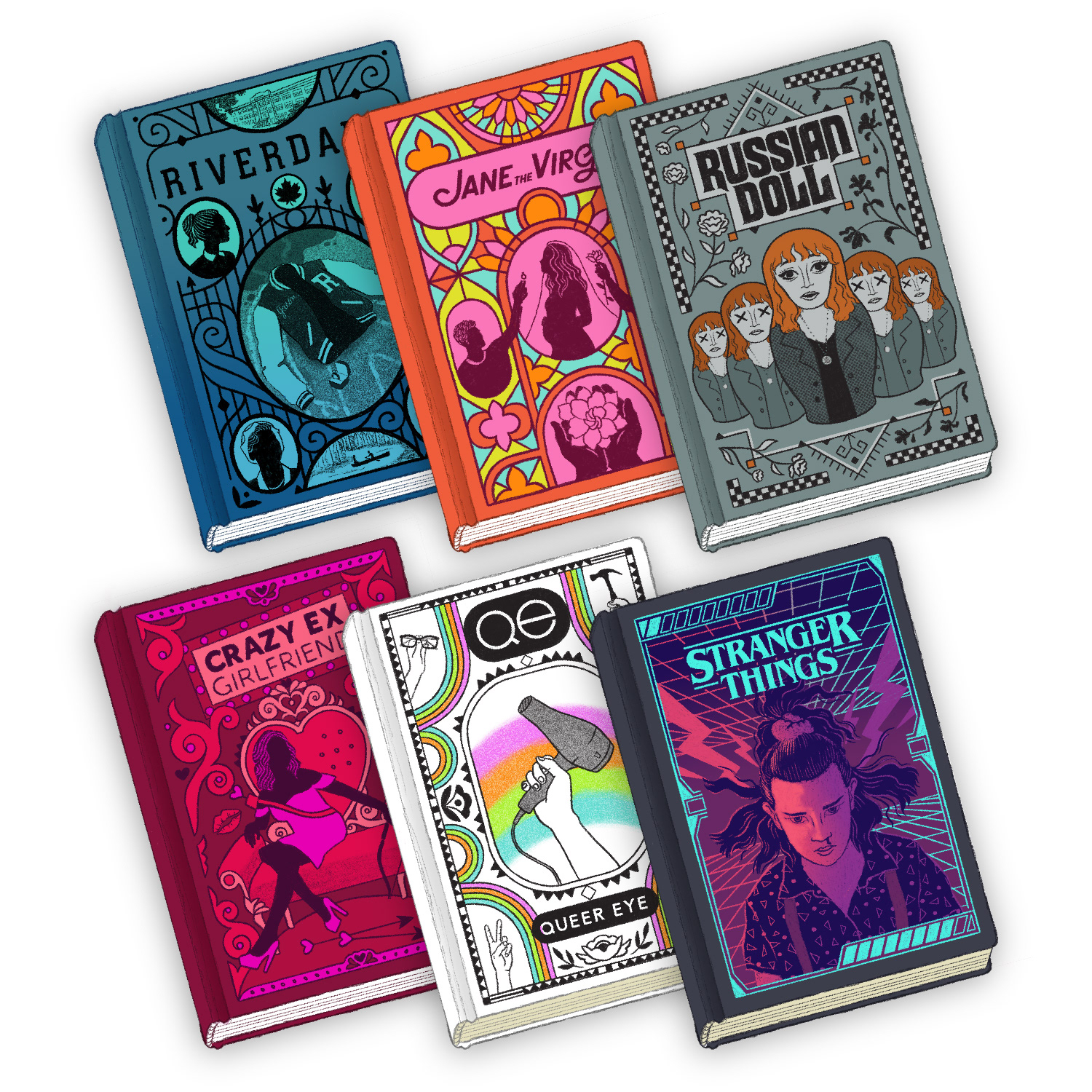
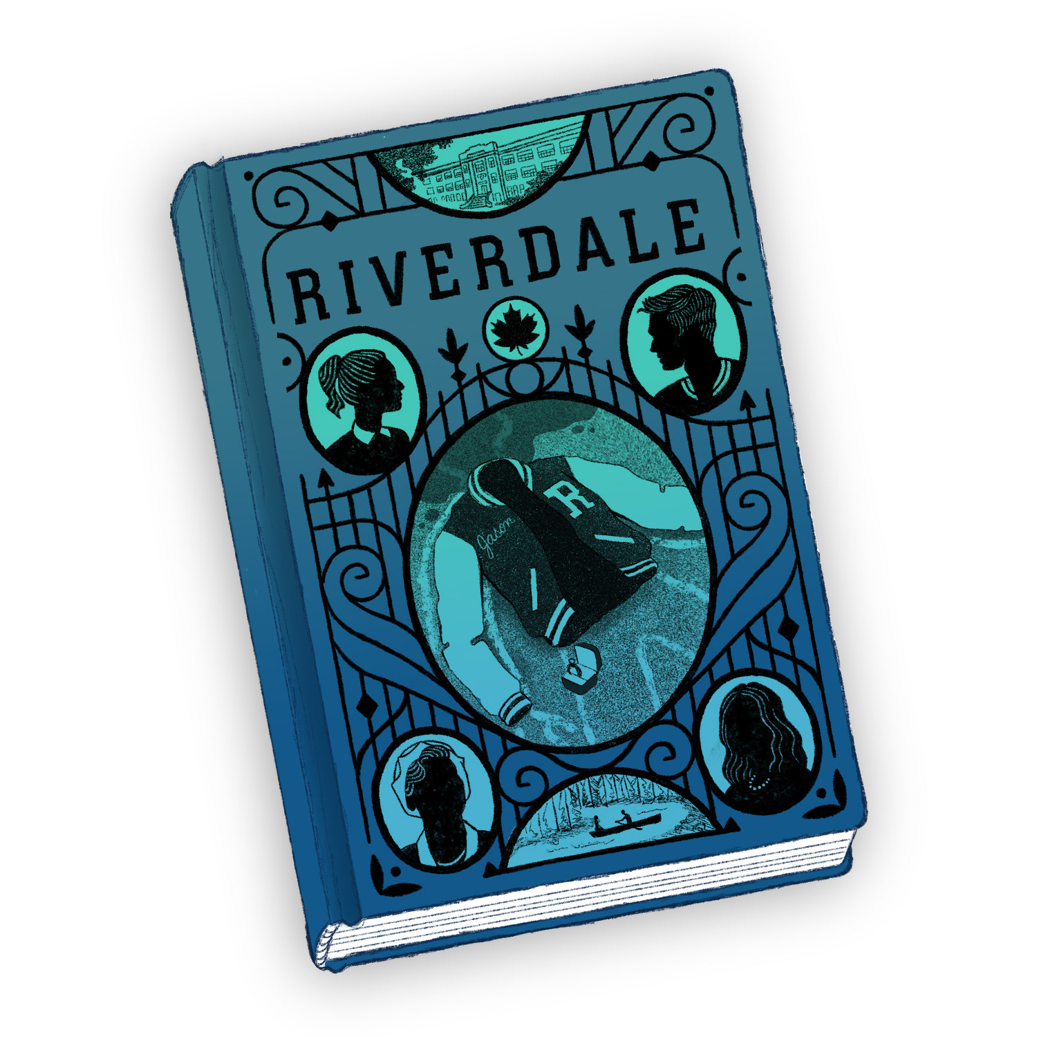
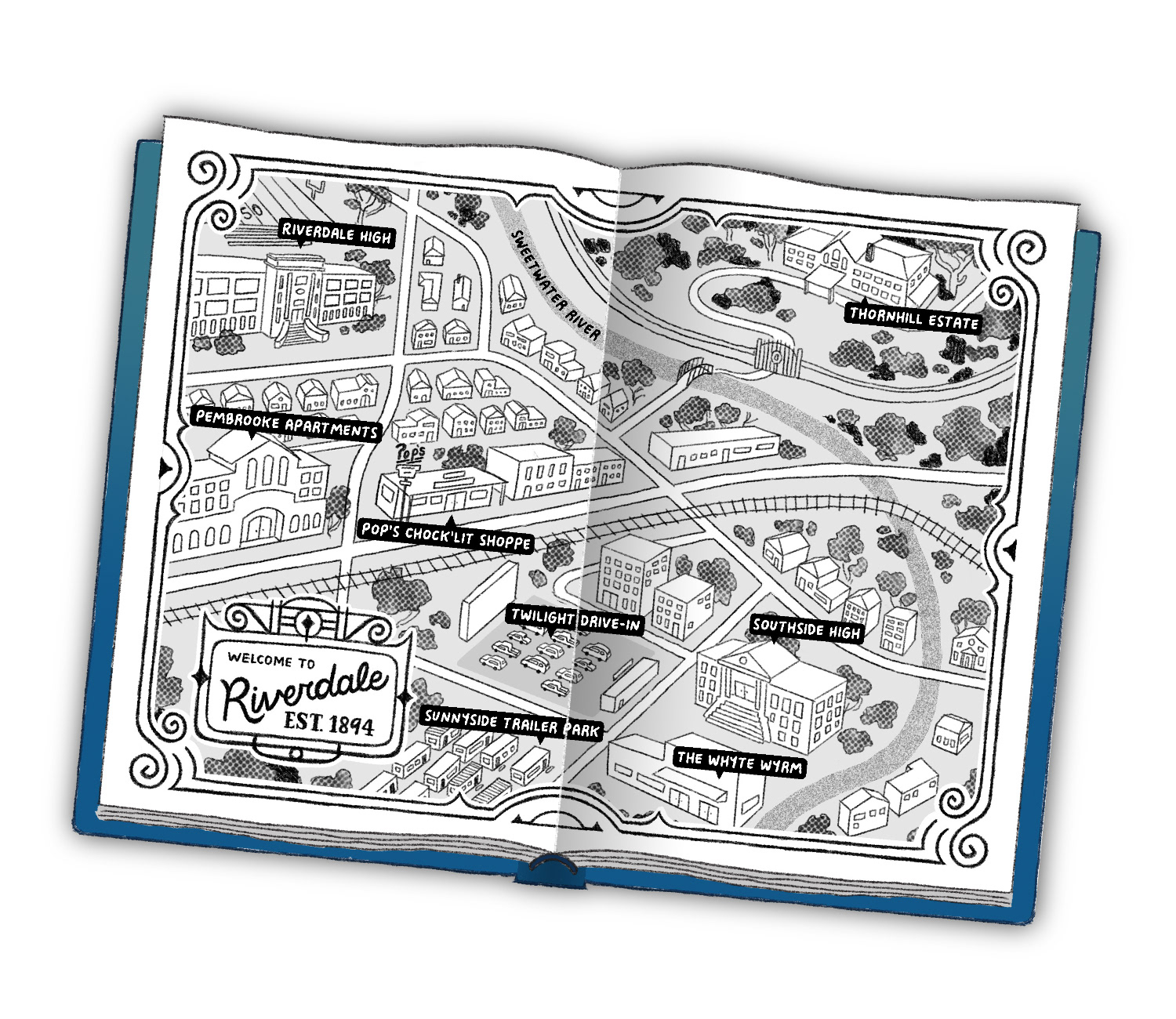
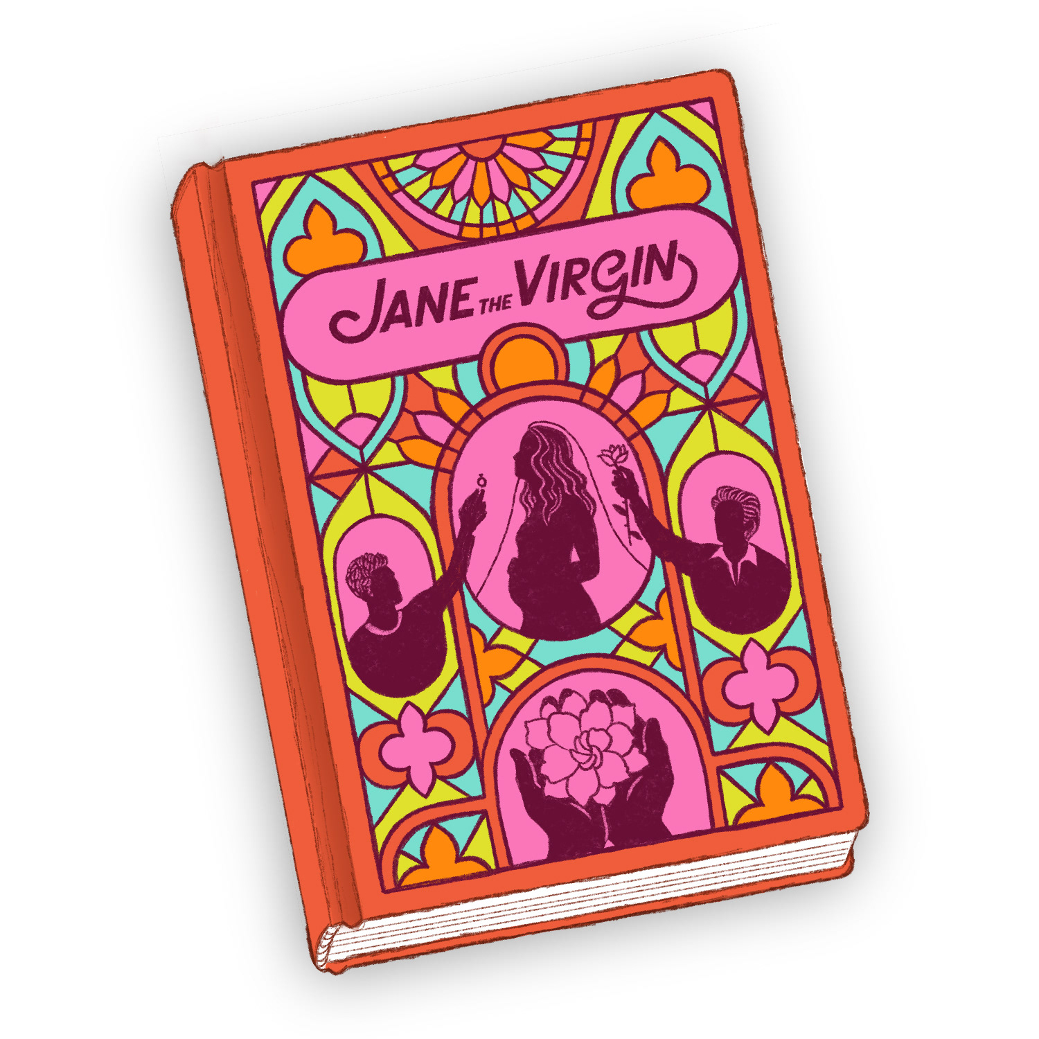
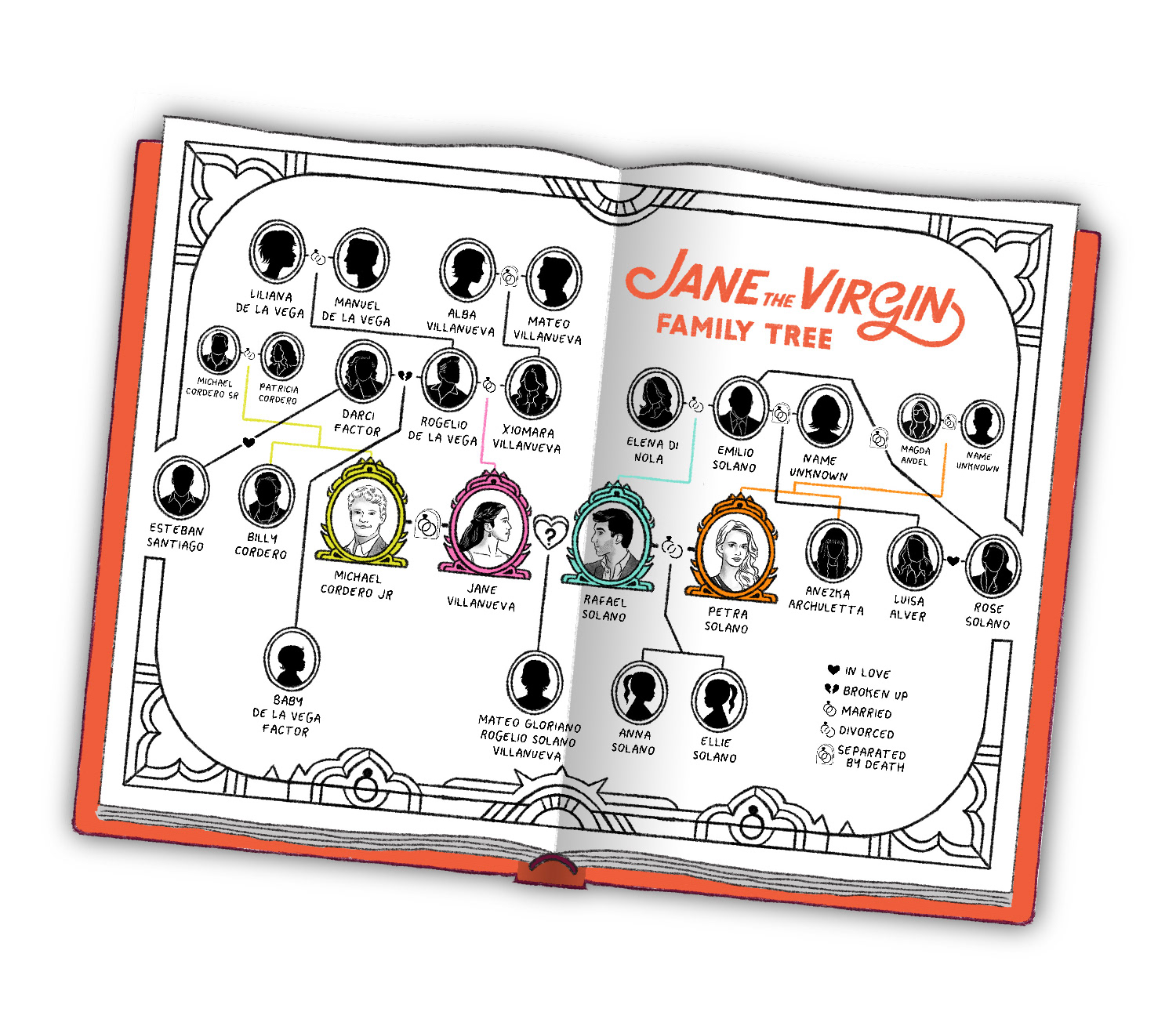
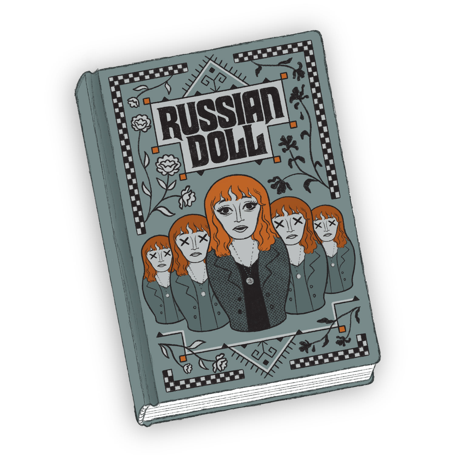
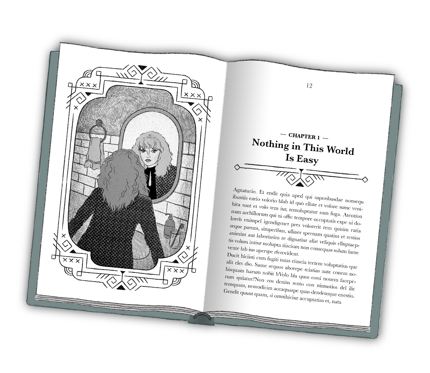
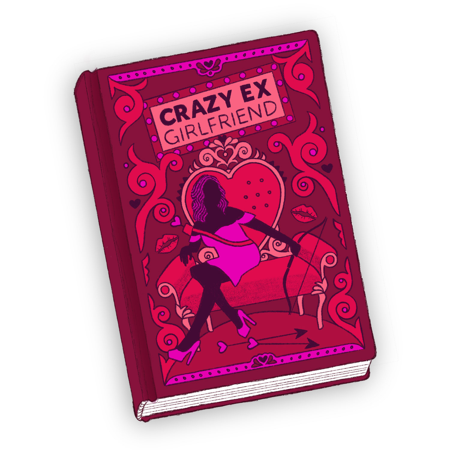
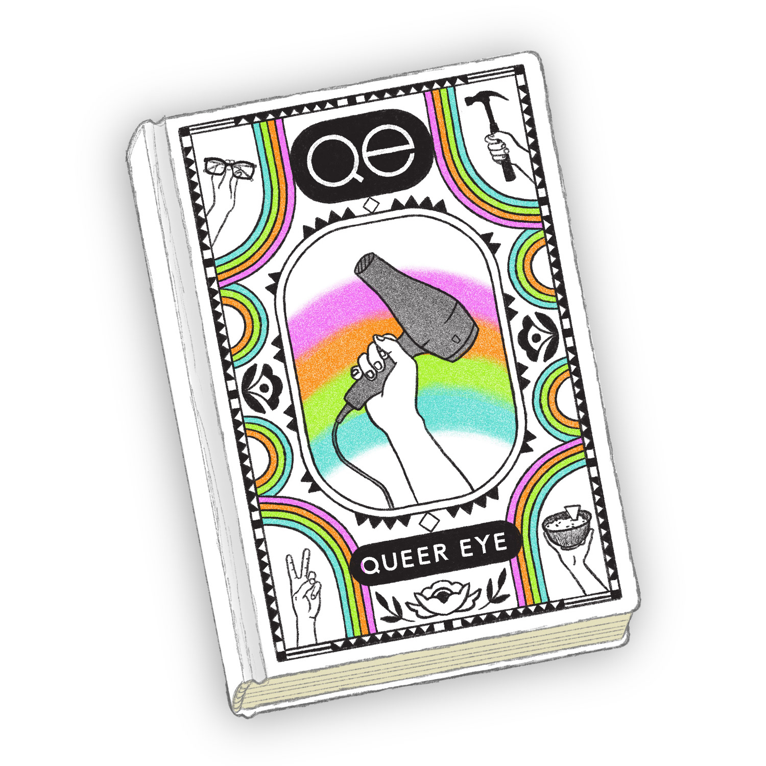
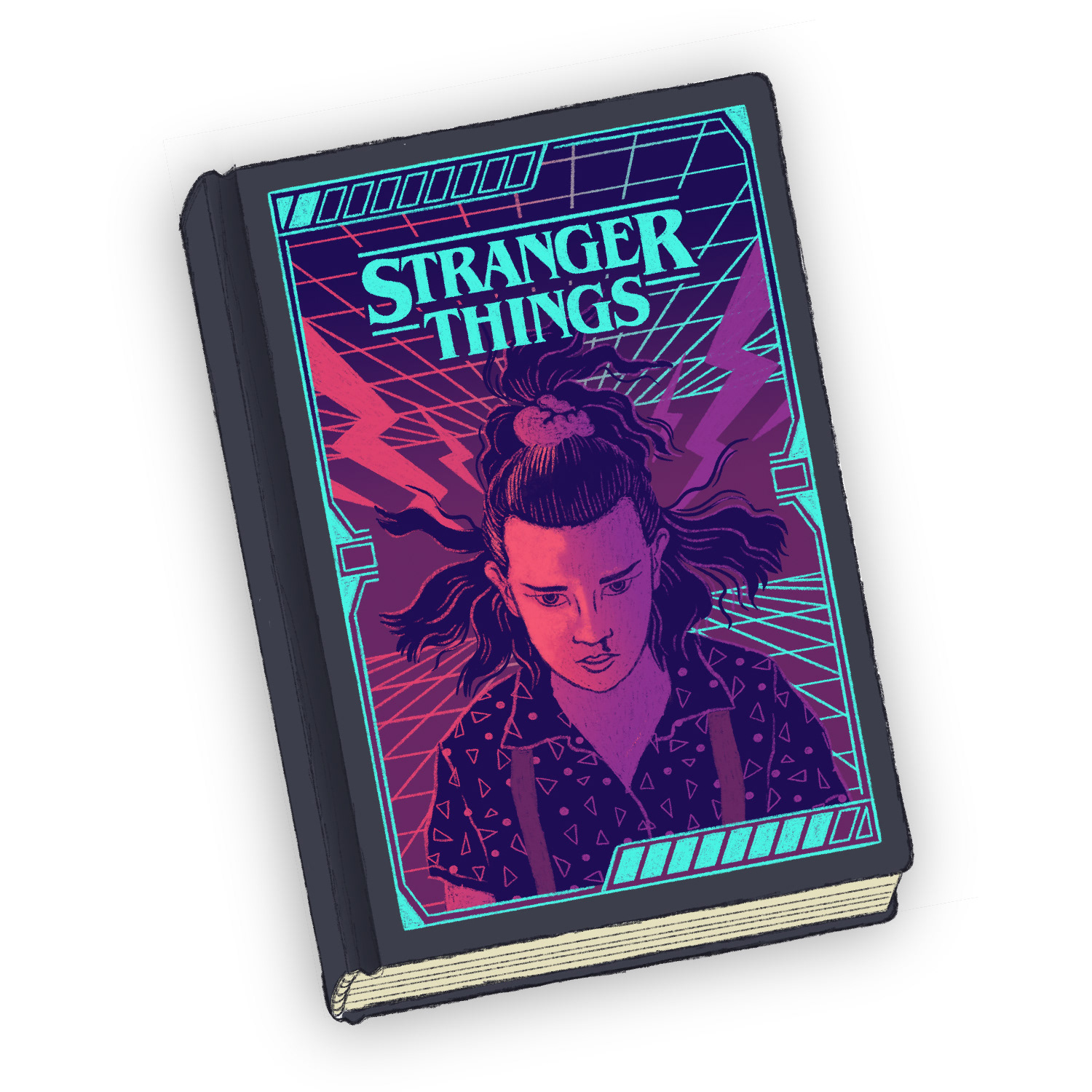
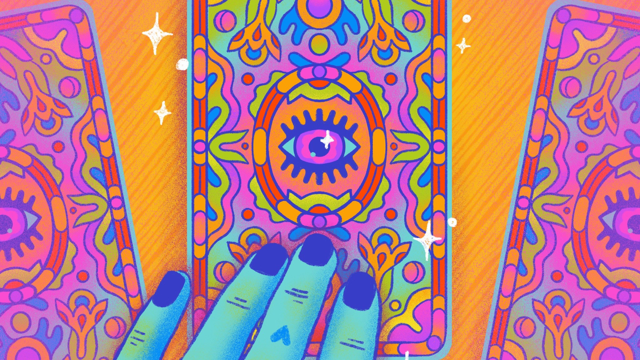
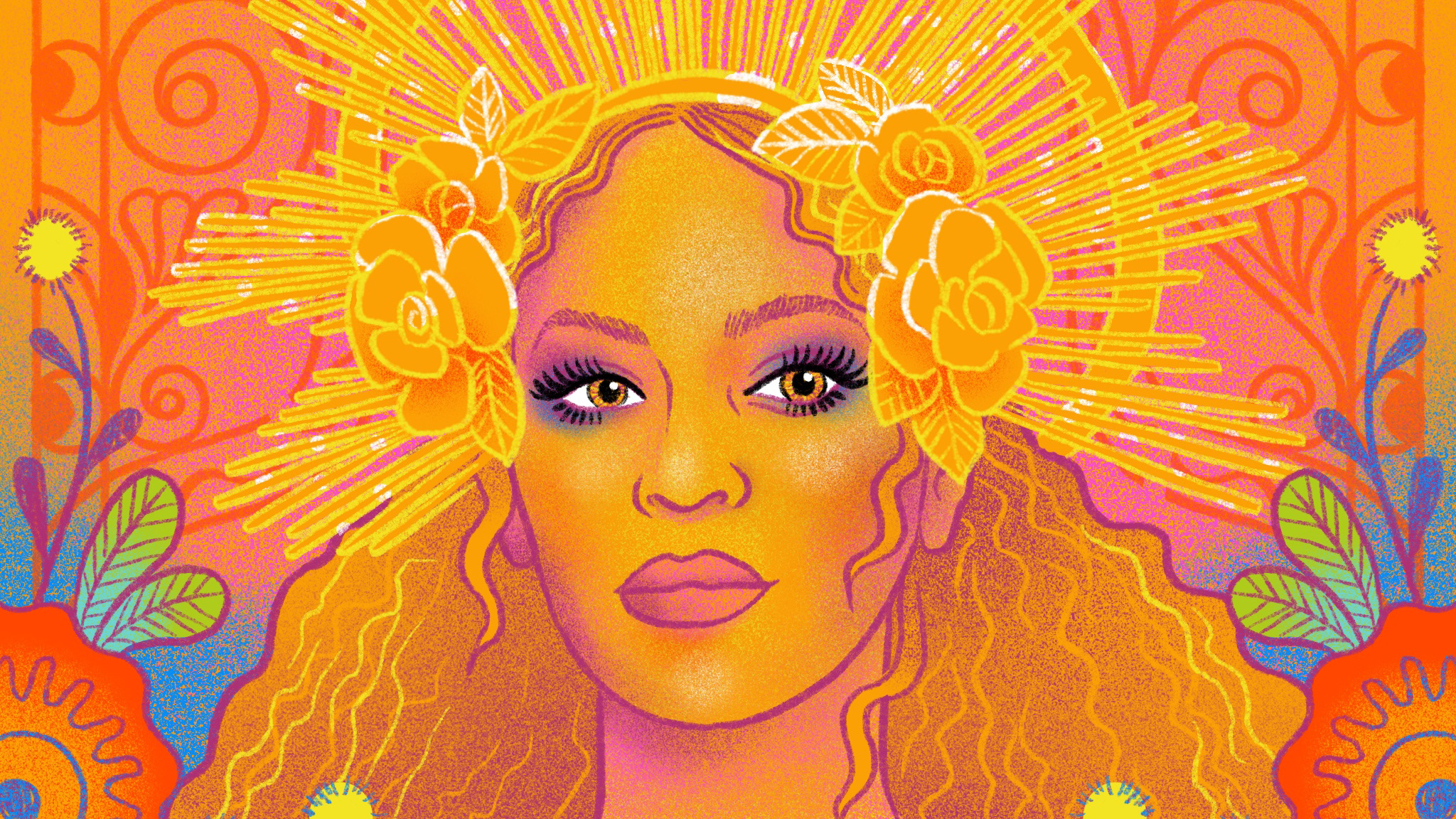
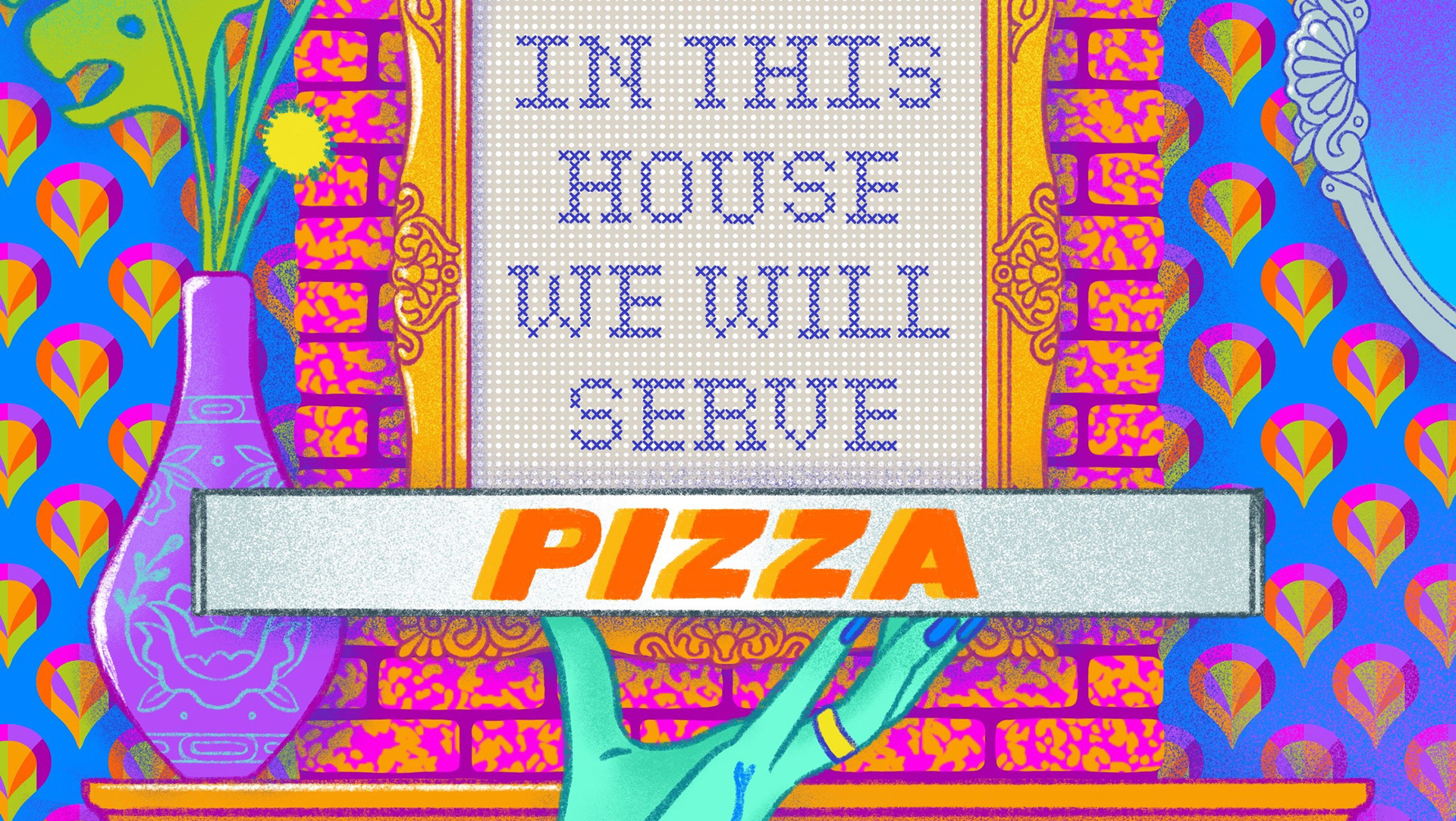
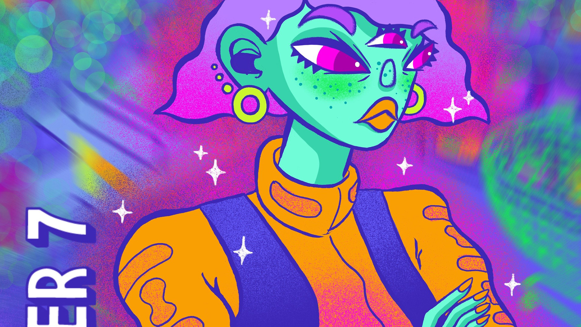
Netflix As Novels
A self-directed creative exercise in which I reimagined Netflix shows in the style of classic leather-bound books, with ornate patterns and easter eggs that give the viewer a sense of the story's content.
You may also like
2024
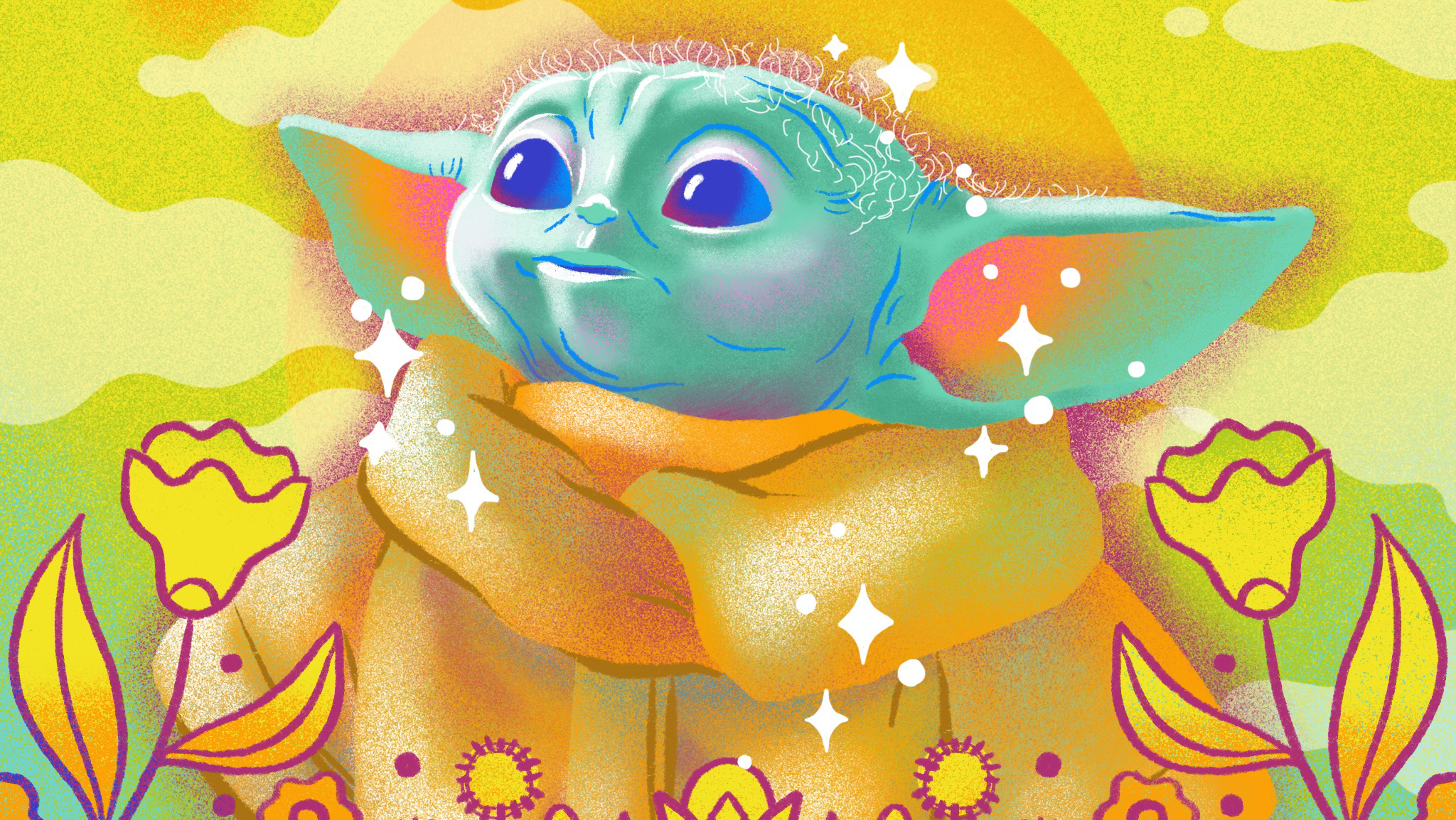
Baby Yoda
2024
Tarot Card
2024
Beyoncé
2020
Vandalizing Tradition
2020
Have a Nice Orbit
2021
Facebook Fashion Forecast
2021
Illustrations for Medium
2024
High Dive Brewing
2024
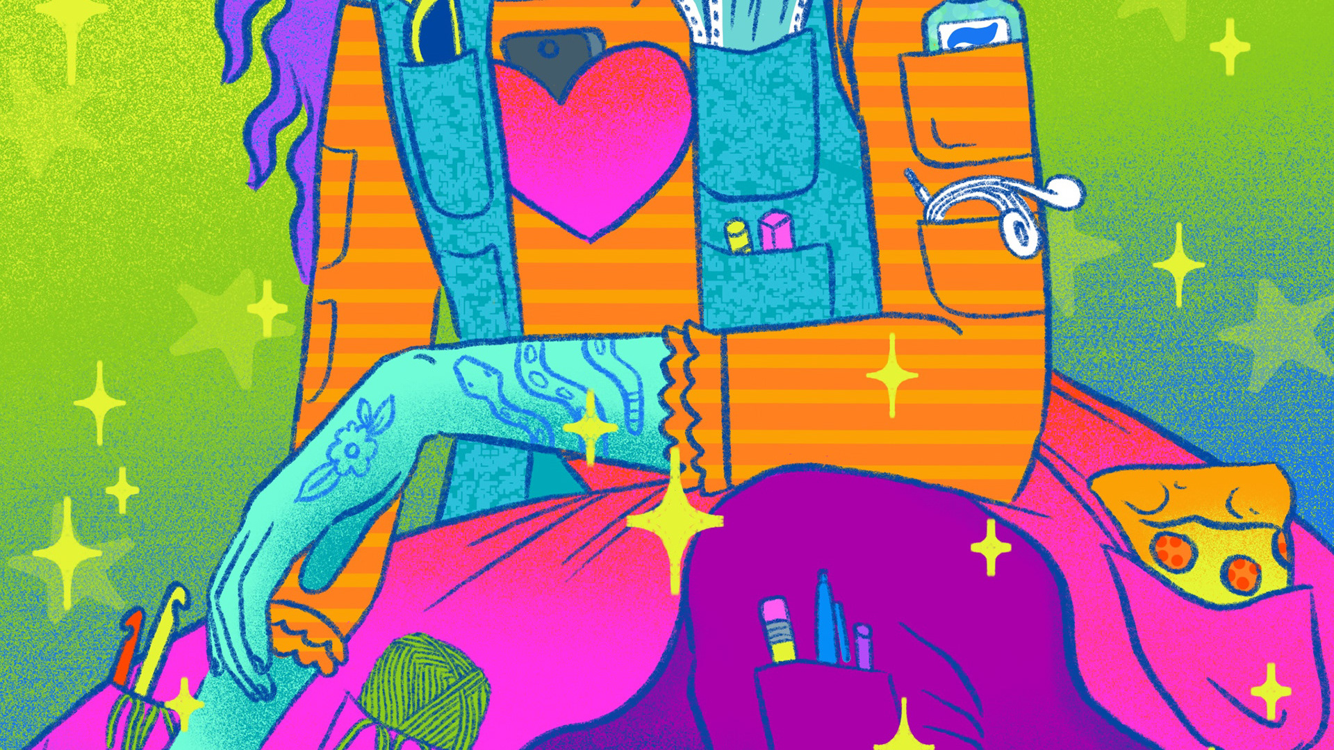
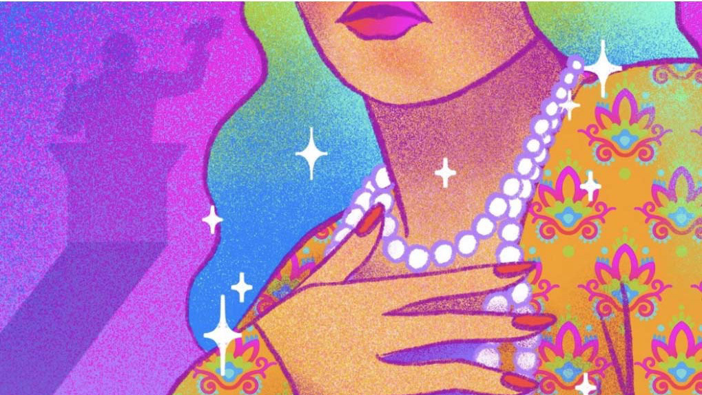
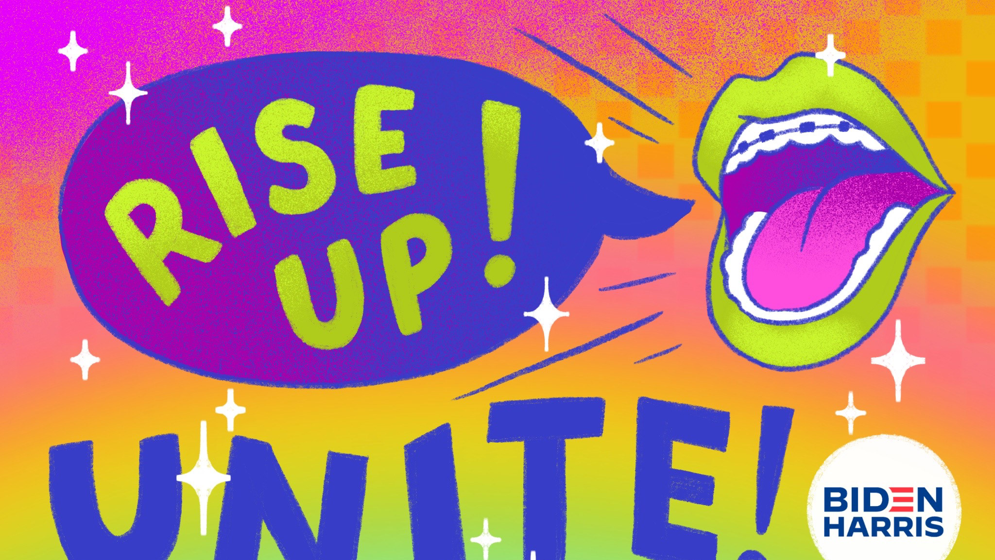
Art Campaign for 2020 Election
2024
Texas Scientist 2021
↑
Back to Top